


Client:
Magna Steyr / Scoop and Spoon
Magna is a global supplier of technologically-advanced automotive systems, components and complete modules. They are a leading global automotive supplier with 317 manufacturing operations and 102 product development, engineering and sales centres in 29 countries.
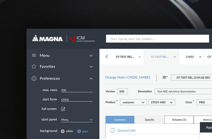
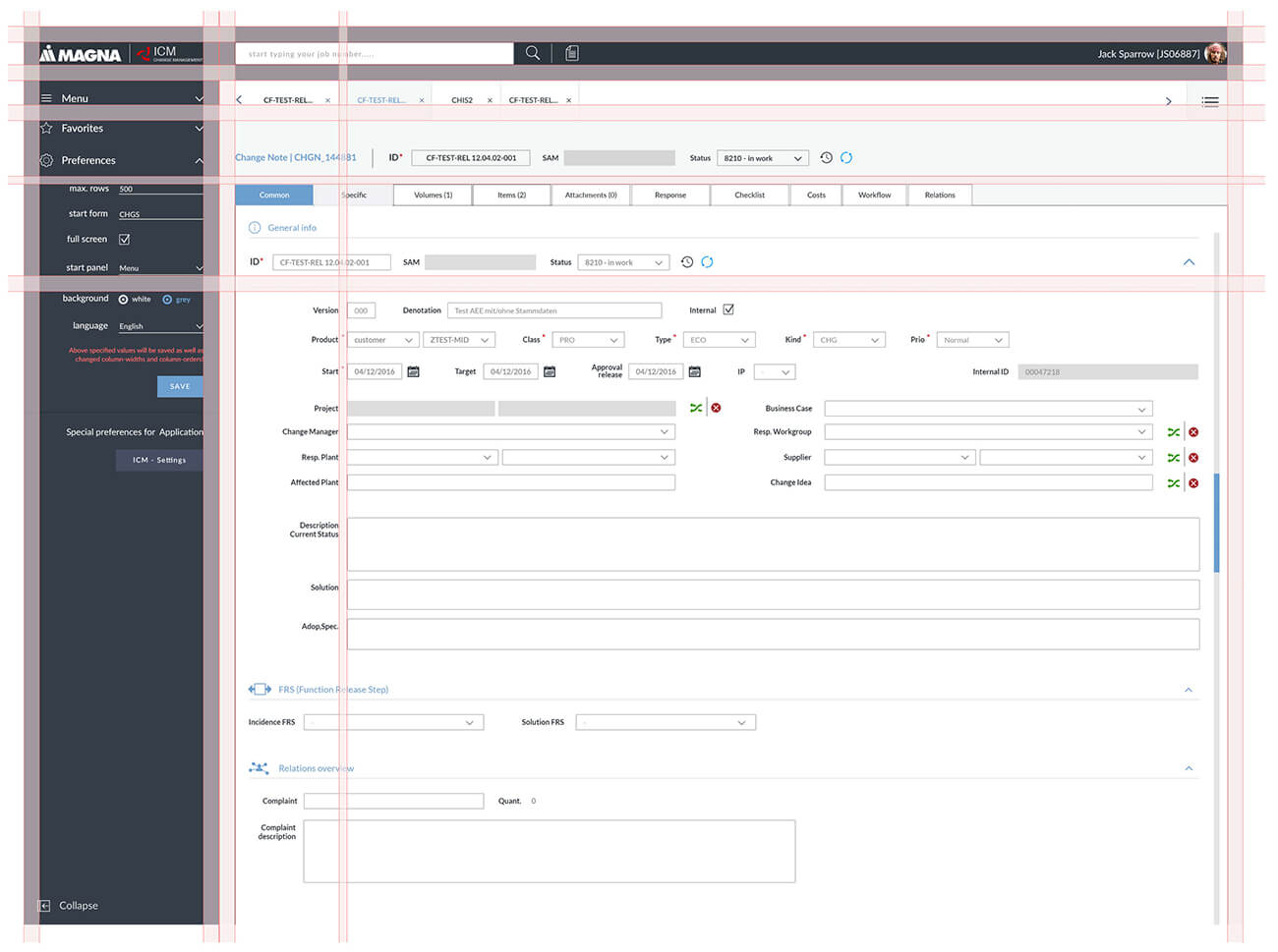
Magna services need a lot of personal online tools for the employees. As a lead UI/UX designer, I had a chance to refresh some of them. ICM change management helps to track jobs, enables internal communication and cooperation. The tool is used for a wide number of employees, some of them with traditional approaches to their tools.
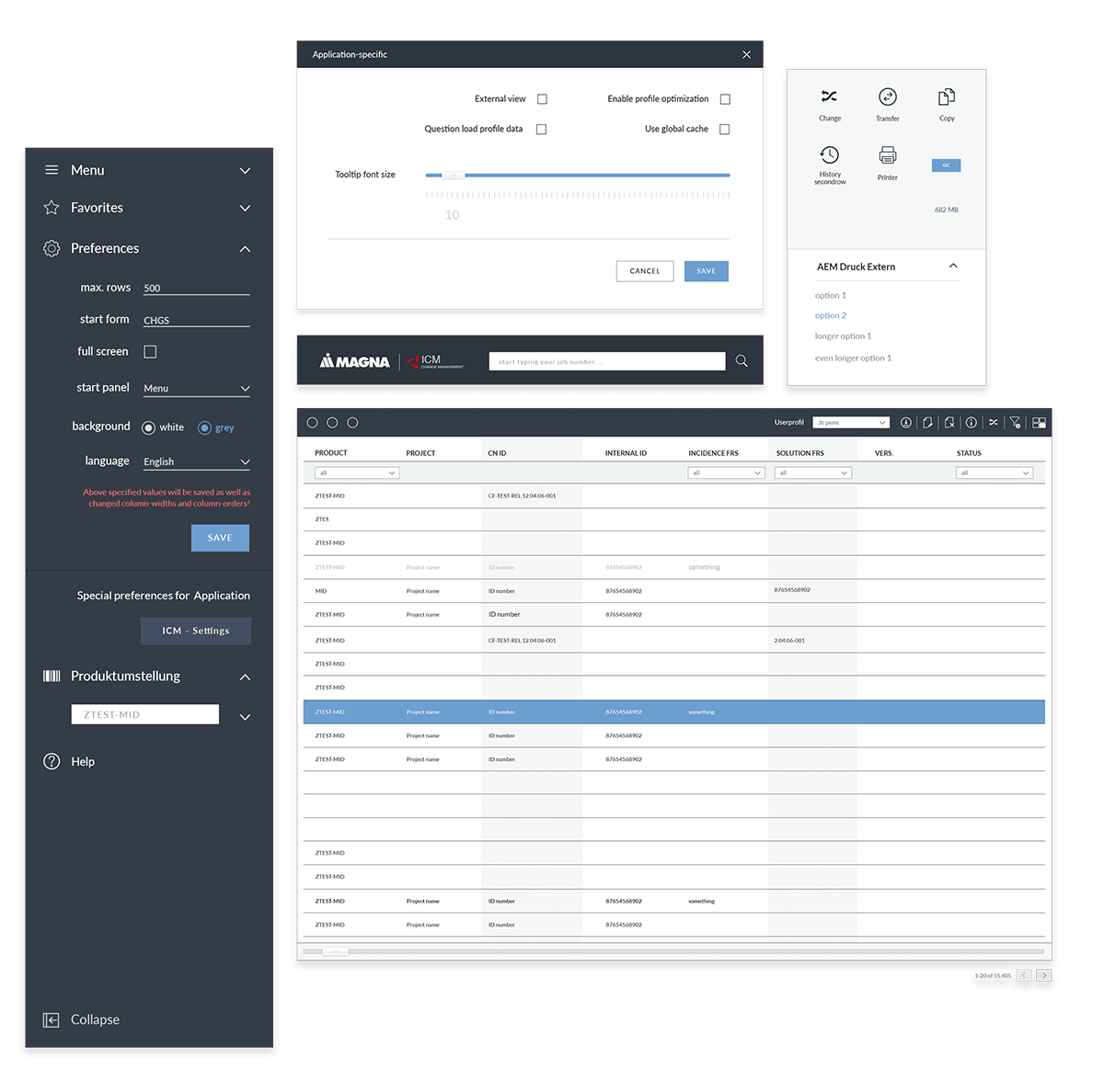
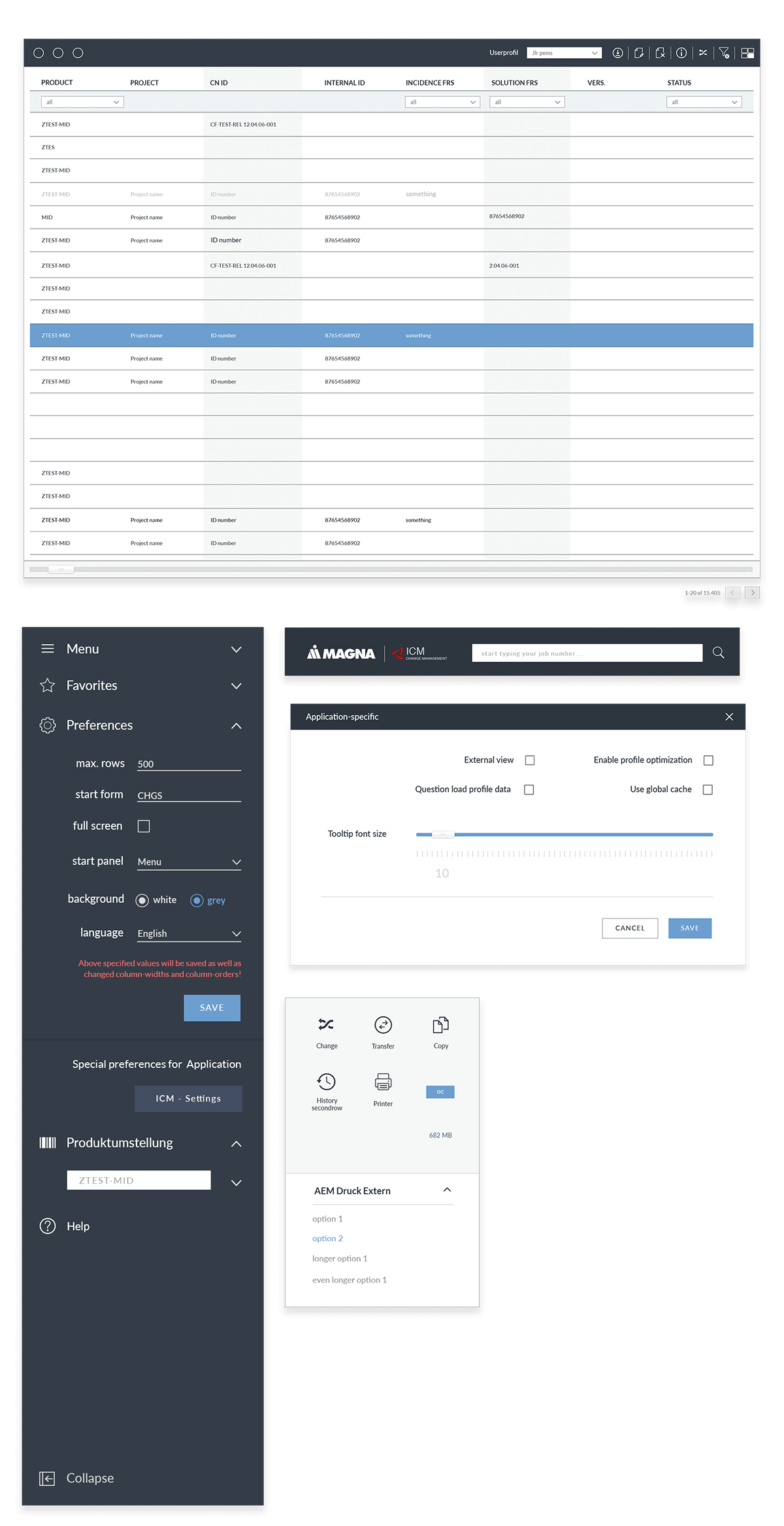
Challenge over here was to create something quite universal and flexible for employees to use. The dashboard had to be personalizable, and easy to navigate. Number of tasks would change depending on employee status and rights, so grid had to be flexible and work within different situations.
Change
History
Copy
Save
Footer
Document
Price
Rows
Download
Search
Edit
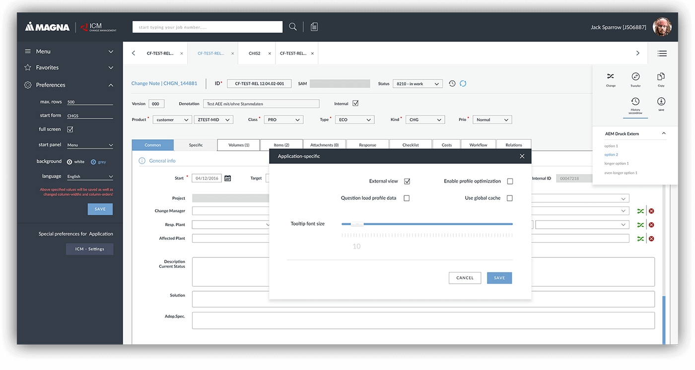
With a complex platform, it is essential to create a grid. Multiples of 8 pixel structure, proves to be one of the best solutions, ensuring that any element would work together.
Second project, performance score card app
The client was really pleased with the results of the ICM project and requested some more jobs. Performance app is another internal tool for Magna employees only. Main users would be engineers and quality testers. The idea was to create an easy to access app, to check the performance of their products. Mobile app was a must.
The biggest challenge over here, was to take these complex data and convert them to a simple visual in few clicks.
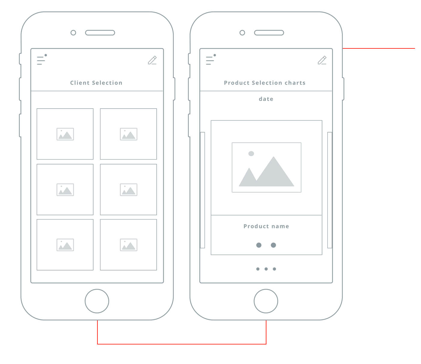
While creating the user experience, natural was the "one action at the time" approach. From complex excel sheets I've managed to create a straight forward user flow
Client selection found it's position as the first step. Later app will narrow the search, to products connected to this client. Simple navigation will allow to browse through main categories and also monitor data status by 2 indicators. Red indicator bellows product name would appear when something needed attention.
The next step would be to select a product in sub categories and have a look at the results.
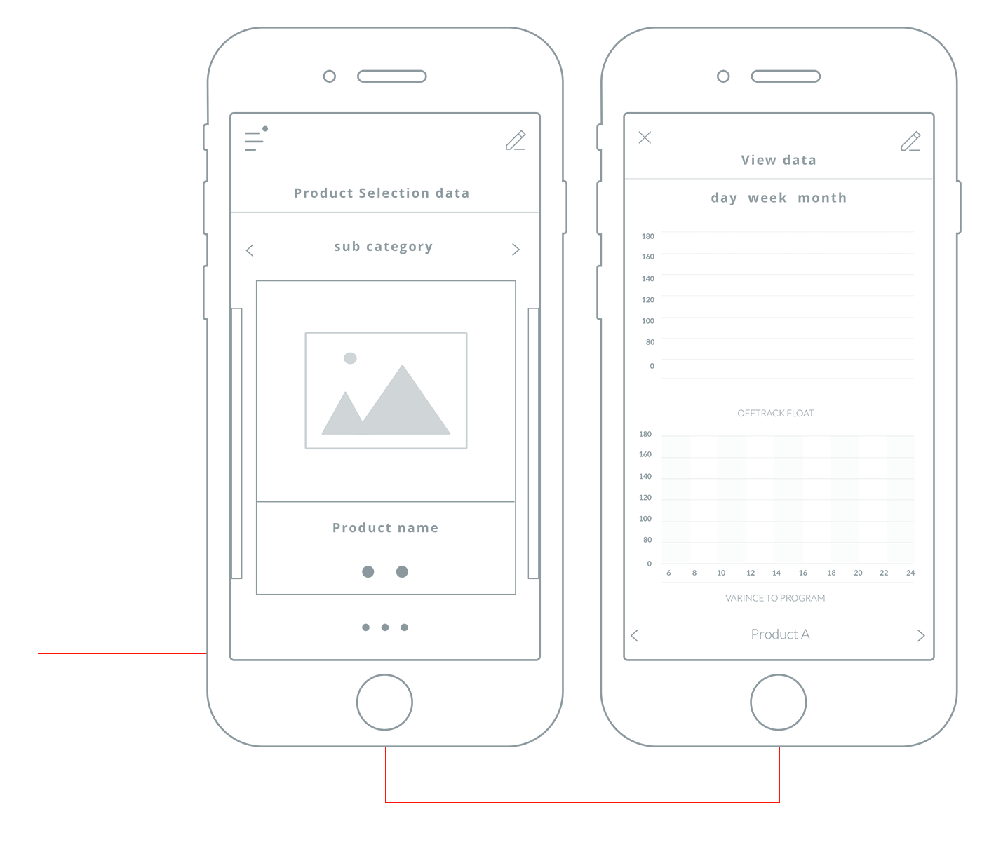
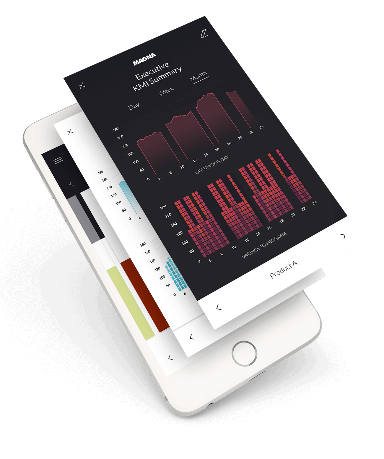
The decision came to present data in two ways: numbers and graphs, the user could easily switch his view from one to another, but depending on the complexity of product data, default view would be always chosen. Depending on a product there would be added filters such as: time (day, week, month) or product sub-categories.